Showing posts with label CSS. Show all posts

Sunday, August 19, 2012

Show a Message To User By Clicking on Button


When We Click on any button in some PRO website's OR in PRO blogs we show the Pop-Up message with some kind of message for user which gives some instruction about the website OR blog OR about the special notifications for user.


What is This....?

If you want to show the visitor a message when he or she clicks on a button or a link you would maybe want to try this code.


Live Demo


Click Here


Codes

  • Copy below codes
  • Paste where you want to show

<style>
/*--- Message To User By Click On Button By www.fblatest.in --- */

.btnLogin
{
    -moz-border-radius:2px;
    -webkit-border-radius:2px;
    border-radius:15px;
    background:#a1d8f0;
    background:-moz-linear-gradient(top, #badff3, #7acbed);
    background:-webkit-gradient(linear, center top, center bottom, from(#badff3), to(#7acbed));
    -ms-filter: "progid:DXImageTransform.Microsoft.gradient(startColorStr='#badff3', EndColorStr='#7acbed')";
    border:1px solid #7db0cc !important;
    cursor: pointer;
    padding:11px 16px;
    font:bold 11px/14px Verdana, Tahomma, Geneva;
    text-shadow:rgba(0,0,0,0.2) 0 1px 0px;
    color:#fff;
    -moz-box-shadow:inset rgba(255,255,255,0.6) 0 1px 1px, rgba(0,0,0,0.1) 0 1px 1px;
    -webkit-box-shadow:inset rgba(255,255,255,0.6) 0 1px 1px, rgba(0,0,0,0.1) 0 1px 1px;
    box-shadow:inset rgba(255,255,255,0.6) 0 1px 1px, rgba(0,0,0,0.1) 0 1px 1px;
    margin-center:12px;
    float:center;
    padding:7px 21px;
}

.btnLogin:hover,
.btnLogin:focus,
.btnLogin:active{
    background:#a1d8f0;
    background:-moz-linear-gradient(top, #7acbed, #badff3);
    background:-webkit-gradient(linear, center top, center bottom, from(#7acbed), to(#badff3));
    -ms-filter: "progid:DXImageTransform.Microsoft.gradient(startColorStr='#7acbed', EndColorStr='#badff3')";
}
.btnLogin:active
{
    text-shadow:rgba(0,0,0,0.3) 0 -1px 0px;
}
/*--- Message To User By Click On Button By www.fblatest.in --- */
</style>

<!-- This Script by www.fblatest.in, Coded By: Krishna | Designing By: Hemant Verma-->

<!-- Start of Message Alert -->
<!-- Use this button in a form to pop-up a message when the user clicks it -->
<center>
<form>
<input type="button" value="Message" class="btnLogin" onClick="alert('Write Your Message Here'); return true">
</form>
</center>
<!-- End of Message Alert -->


Make Changes....!

  • Replace Message it with your button name.
  • Replace Write Your Message Here it with your message


Enjoy and Have Fun With Your Messages


Thanks for Visit Here Like Us on Facebook.
If Any Problem, Ask in Comments Follow US on Twitter.

Tuesday, August 7, 2012

Create A Calculator Using JavaScript CSS HTML


AS we all know that mathematics is very important for us and we can create any calculation using calculator and we can also create and develop calculator by using all of the programming language like C, C++, Java, etc. bt today we willl give the Calculator which is made by HTML CSS and JavaScript.

You can easily use calculator on your Blog/website very easily.This Calculator is made by using JavaScript, CSS, HTML.


Codes of Calculator


Thanks for Visit Here Like Us on Facebook.
If Any Problem, Ask in Comments Follow US on Twitter.

Sunday, August 5, 2012

Show HTML and Other Codes With Code Language Name


As we give previously Show HTML and Other Codes in blogger, Now this is new and updated widget with tutorials of blogger where you can show your codes in blogger with coding language name like jQuery, HTML, CSS, JavaScript etc, this tutorial is very simple and very highly customize with CSS Codes. It's a very Pro widget be'coz it include the orange bar where you can mention the code name with your site name.


Series of Show Codes in Blogger


Add CSS Codes of Widget

  • Login to Blogger > Dashboard
  • Go to Design > Edit HTML
  • Search for 
]]></b:skin>
  • Paste below code before ]]></b:skin>
/*------Codes By www.fblatest.in------*/


pre{
position:relative;
background:#333;
color:white;
font-family:Monaco, Courier, MonoSpace;line-height:1.8;-moz-border-radius:8px;-webkit-border-radius:8px;border-radius:8px;font-size:12px;padding:10px;margin:0 0 25px 0;overflow:auto}pre code{padding:0;color:white;background:#333;white-space:pre
}


pre[rel]{padding-top:40px}pre[rel]:after{content:attr(rel);position:absolute;top:0;background:#F3A01E;padding:4px;left:0;right:0;font-size:36px;line-height:0;color:white;font:bold 20px "myriad-pro-1",Verdana;


/*------Codes By www.fblatest.in------*/
  •  Save Your Template
 

How to Add it in Post....?

  • After adding the CSS part
  • Go to Posting > Edit HTML 
  • Paste below code where you want to show the HTML CSS and others codes.
<pre class="lang-js" rel="HTML Codes By www.fblatest.in"><code><p>Write Your Codes Here
</code></pre>


Make Changes....!

  • Replace it HTML Codes By www.fblatest.in with coding language and with your site URL.
  • Replace Write Your Codes Here it with your codes.


If Any Problem Comes, Ask In Comments


Thanks for Visit Here Like Us on Facebook.
If Any Problem, Ask in Comments Follow US on Twitter.

Monday, July 23, 2012

Show HTML, CSS Codes in New Three Coloured Background


New and other very different HTML, CSS and other coding backgrounds for blogger which highly customize for blogger from CSS with three different colors on mouse hover effects with big font and highly customization, and it will give a new and better look to your blog, in this tutorial the mouse hover effect also available be'coz when you see it, you will surely like it.


Series of Codes Posting Background


Add CSS Part of Coding Background

  • Login to Blogger > Dashboard
  • Go to Design > Edit HTML
  • Search for
]]></b:skin>
  • Paste below code before ]]></b:skin>
.fblatest { font-size: 15px;font-family: Courier;font-weight: normal;font-style:italic; background-color: #000000; color: #ffffff; width: 90%; margin: 5px 10px; padding: 20px 20px 20px 20px; border: 2px dotted lightgrey; transition: background-color .777s; -webkit-transition: background-color .777s; -moz-transition: background-color .777s; -o-transition: background-color .777s; -ms-transition: background-color .777s; } .fblatest:hover { background-color: #0c991a ; color: #fff; box-shadow: -1px -1px 12px 2px gainsboro; border-radius: 10px; } .fblatest:active { background-color: CornflowerBlue ; color: #000; }
  • Save Your Template 

How to Add it in Post....?

  •  After adding the CSS part
  • Go to Posting > Edit HTML 
  • Paste below code where you want to show the HTML CSS and others codes.
<div class="fblatest"> Replace Text With Your Codes </div>

Make Changes....!

  • 15 Replace it to change the text size (Optional)
  • Replace Replace Text With Your Codes this text with your own codes of HTML CSS JavaScript etc


If Any Problem Comes, Ask in Comments
Thanks for Visit Here Like Us on Facebook.
If Any Problem, Ask in Comments Follow US on Twitter.

Sunday, July 22, 2012

Make Your Image Hover with Sliding Panel


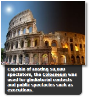
When we add any image to blogger it seems like very simple and many times we saw that some professional blogs OR websites use CSS in their images, so that they look better and rich type content in the blogs. In this effect we add CSS in images and that seems like very rich and they comes with the sliding panel on mouse hover with image description. You can easily add the links in the sliding panel as you see in the image and it will give a professional look to your blog.


1. Add Widget to Blogger

  • Login to Blogger > Dashboard
  • Go to Design > Edit HTML
  • Search for 
<head>
  • Paste below code after <head>
<link type="text/css" href="https://dl.dropbox.com/u/63968842/Slidingpanelwithmousehover%28www.fblatest.in%29.css" rel="stylesheet" />
  • Now Save Your Template.

2. Image Adding Part in the Post

  • Now Go to posting area > Edit HTML
  • Paste below code in it.
<div class="imagepluscontainer" style="width: 263px; height: 199px; z-index: 2;">
<img src="https://blogger.googleusercontent.com/img/b/R29vZ2xl/AVvXsEgT9lLZvYdNuaTU8uZIw_-mABG3mOv4IEGYOCzQBY3r7gGBWCwlEmABwCpjjfE-CtvJbcpx7PJXS_OVmV5g4ECEAhmWvRH4Gcb39m-N4Mupex3B37wyk091MbuQHObD4IAzHoRgxcG6tvs/s1600/stadium.png">
<div class="desc">
Capable of seating 50,000 spectators, the Colosseum was used for gladiatorial contests and public spectacles such as executions.
</div>
</div>


Make Changes....!

  • Replace https://blogger.googleusercontent.com/img/b/R29vZ2xl/AVvXsEgT9lLZvYdNuaTU8uZIw_-mABG3mOv4IEGYOCzQBY3r7gGBWCwlEmABwCpjjfE-CtvJbcpx7PJXS_OVmV5g4ECEAhmWvRH4Gcb39m-N4Mupex3B37wyk091MbuQHObD4IAzHoRgxcG6tvs/s1600/stadium.png this link with your own image link.
  • Adjust the width and height according to your choice from here width: 263px; height: 199px
  • Replace the description about image from here Capable of seating 50,000 spectators, the Colosseum was used for gladiatorial contests and public spectacles such as executions. according to your description.
  • If you want that sliding panel comes upper side of image then after <div class="desc"> add upslide word with a space like this ===>> <div class="desc upslide">
  • If you want that sliding panel comes from right side then add rightslide 
  • If you want that sliding panel comes from left side then add   leftslide


If Any Problem Comes, Ask in Comments


Thanks for Visit Here Like Us on Facebook.
If Any Problem, Ask in Comments Follow US on Twitter.

Friday, July 20, 2012

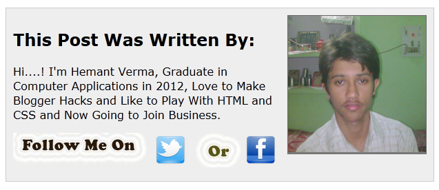
Guest Author Bio Widget with Mouse Hover


Guest Author Bio Widget is important for guest author be'coz when we invite any blogger to write any post then we have to give a description about her/him, end of our post. So, we have a special widget for it.

Hemant Verma


Guest Author Bio Widget

  • Login to Blogger > Dashboard
  • Go to Posting > Edit HTML
  • At the end of guest post paste below code
 <link href='https://dl.dropbox.com/u/63968842/guestauthorbio%28www.fblatest.in%29.css' rel='stylesheet'/>


<div class='fbauthor_info'>
<div class='fbauthor_photo'>
<img alt='author' height='200' src='https://blogger.googleusercontent.com/img/b/R29vZ2xl/AVvXsEghePfv-HIROGtXuVROzMxyWsOHMKlFR0neMtClTpUxlKCqfPq54ME9wLwvv5Rw8PfV_jJWIWTVPYnYx-Pq76eqRXTT9aIY9oPPWgJOzlFqdqRLe9fSE6c3Sw2VJmvVrNBodBUrSvIJIkr2/s1600/Butnty.jpg' width='200'/></div>
<h2><font face="verdana">This Post Was Written By:</h2>
<p> Hi....! I'm Hemant Verma, Graduate in Computer Applications in 2012, Love to Make Blogger Hacks and Like to Play With HTML and CSS and Now Going to Join Business. </p>
<table><tr><td><tr><img border="0"  src="http://1.bp.blogspot.com/-pMFW6caNEFg/TvsbhY3ppGI/AAAAAAAACDM/Wx5jw_HAeBw/s1600/untitled+copy.jpg" />
<a href='http://twitter.com/hemantverma003' target='_blank'><img alt='Twitter' src='https://blogger.googleusercontent.com/img/b/R29vZ2xl/AVvXsEiDovCPUdHJtqweSM_30g0qCKmzRT0IGvLRJt4WaGH-RRvfvPluCDxnoDSrPrBzjAOMnTOEN6vtKBCnLgGBrPSulRHiBLFOfuth75t51oE1cDM6FMH5M8UJOp0pIDu17hSeDxNFW66EEG-j/s48/Twitter2.png'></tr></a><tr><img border="0" src="http://4.bp.blogspot.com/-tMN8XVMaUAg/Tvshc3zjf0I/AAAAAAAACDY/WdAW8406v-g/s1600/or.jpg" /></tr><a href='http://www.facebook.com/COMPUTERS.TRICKS' target="_blank"><img alt='Facebook'  src='https://blogger.googleusercontent.com/img/b/R29vZ2xl/AVvXsEj0iSEmqj1CgYkv_zH3iUN9wkMMMbPm24ANDDGK6xU78xnd8cEeLPc-opk2y6f3oXkCPusEHYZx_c4QNBeUEXkU6v7-dZUwJ50O5V9WR9Ee7YawYMbHatIfGC3qi5Cy__MkEF8jw6HbM1Uq/s48/Facebook.png'></a></td></tr></table></font>
<p style=' line-height:0px; font-family:Arial; font-size:8px; font-weight:bold; text-align:right;'><a href='http://www.fblatest.in/2012/07/guest-author-bio-widget-with-mouse-hover.html' style='color:#CAC8C8;'>Get This</a></p></div>


Make Changes....!

  • Replace https://blogger.googleusercontent.com/img/b/R29vZ2xl/AVvXsEghePfv-HIROGtXuVROzMxyWsOHMKlFR0neMtClTpUxlKCqfPq54ME9wLwvv5Rw8PfV_jJWIWTVPYnYx-Pq76eqRXTT9aIY9oPPWgJOzlFqdqRLe9fSE6c3Sw2VJmvVrNBodBUrSvIJIkr2/s1600/Butnty.jpg this link with your own snap link.
  • Replace  Hi....! I'm Hemant Verma, Graduate in Computer Applications in 2012, Love to Make Blogger Hacks and Like to Play With HTML and CSS and Now Going to Join Business. this author info with your guest author's info.
  • Replace hemantverma003 this twitter name with author's twitter name.
  • Replace COMPUTERS.TRICKS this facebook username with author's facebook page  OR author's profile username.


Note: Don't Change Anything from Codes be'coz All Codes are Highly Sensitive.


Thanks for Visit Here Like Us on Facebook.
If Any Problem, Ask in Comments Follow US on Twitter.

Thursday, July 19, 2012

CC3 Typing Animation


www.fblatest.in
CSS 3 is going to be very messive hit day by day and we can easily create the animations using the CSS 3 and HTML be'coz CSS 3 provide us the very awesome technique with unique methods of animation. So, our friend create a Typing Animation with the help of CSS 3 and HTML, which will automatically generate the text and animation will like the typing from keyboard.


Codes of CSS 3 Typing Animation

<html>
<head>
<style>
@-webkit-keyframes typing {
    from { width: 0 }
    to { width:16.3em }
}
@-moz-keyframes typing {
    from { width: 0 }
    to { width:16.3em }
}
@-webkit-keyframes blink-caret {
    from, to { border-color: transparent }
    50% { border-color: black }
}
@-moz-keyframes blink-caret {
    from, to { border-color: transparent }
    50% { border-color: black }
}
body { font-family: Consolas, monospace; }
h5 {
    font-size:150%;
    width:16.3em;
    white-space:nowrap;
    overflow:hidden;
    border-right: .1em solid black;


    -webkit-animation: typing 17s steps(30, end), /* # of steps = # of characters */
                        blink-caret 1s step-end infinite;
    -moz-animation: typing 17s steps(30, end), /* # of steps = # of characters */
                        blink-caret 1s step-end infinite;
}
</style>
</head>
<body>
<h5><font color="red"><3 "I Love You My Rose" <3</font></h5>
</body>
</html>

Make Changes....!

  • Replace <3 "I Love You My Rose" <3 text with your own text.


Thanks for Visit Here Like Us on Facebook.
If Any Problem, Ask in Comments Follow US on Twitter.

Saturday, July 7, 2012

Pro CSS Buttons for Blog and Website


Many Professional Bloggers and Web Developers use CSS buttons for their blog OR website and now we are introduce some fresh and pro CSS buttons for blog which will help to MAKE YOUR BLOG LIKE A PRO, and this is simply made by the CSS and embed with the HTML codes.


 CSS Buttons for Blog and Websites


  • Login to Blogger > Dashborad
  • Go to Design > Edit HTML
  • Click on Check Expand on Template.
  • Search for </head>
  • Paste below code before </head>
 <link type="text/css" href="https://dl.dropbox.com/u/63968842/CSS%20Buttons%20%28www.fblatest.in%29.css" rel="stylesheet" />
  • Save Your Template. 
 

How to Add Buttons

Now below we have given 10 styles where you want to add these buttons just simply copy that code and paste in the Edit HTML of posting background.


Example:-
<a href="#" class="fblatest">Demo 1</a>


10 Different Styles of CSS Buttons

<a href="#" class="fblatest">Demo 1</a>

 <a href="#" class="fblatest1">Demo 2</a>


  <a href="#" class="fblatest3">Demo 3</a>


  <a href="#" class="fblatest2">Demo 4</a>


  <a href="#" class="fblatest4">Demo 5</a>


  <a href="#" class="fblatest5">Demo 6</a>


  <a href="#" class="fblatest6">Demo 7</a>


  <a href="#" class="fblatest7">Demo 8</a>


  <a href="#" class="fblatest8">Demo 9</a>


  <a href="#" class="fblatest9">Demo 10</a>


Make Changes....!

  • # Replace with your link.
  • Demo Replace with your text.


Thanks for Visit Here Like Us on Facebook.
If Any Problem, Ask in Comments Follow US on Twitter.

Friday, June 29, 2012

Remove H from Hellobar


Hello Bar is the very important and very unique widget for blog OR sites it help us to show the notifications on the top of the blog or site, but when we add that bar it shows the H logo and we can't hide that H logo but now we can do it very easily. It's very simple by adding some CSS codes in the CSS area, it will hide the H logo from Hello Bar.


Hide Hello Bar Logo for Blogger

  • Login to Blogger > Dashboard
  • Go to Design > Edit HTML
  • Search for ]]></b:skin>
  • Paste below code before ]]></b:skin>
a#hellobar-logo, a#hellobar-logo:link, a#hellobar-logo:visited {
display:none;
}
  • Save Your Template.

Hide Logo in Wordpress

  • Search for </head> tag.
  • Paste below code above </head>
<style type='text/css'>
a#hellobar-logo, a#hellobar-logo:link, a#hellobar-logo:visited {
display:none;
}
</style>
  • Save Your Template.


Thanks for Visit Here Like Us on Facebook.
If Any Problem, Ask in Comments Follow US on Twitter.

Thursday, June 28, 2012

Pro Email Subscription Box For Blogger


After some hard work and helping with our friends, we have some email subscription box for your blog which will give your blog a rich look and pro feel.

Pro Email Subscription Box For Blogger


Thanks for Visit Here Like Us on Facebook.
If Any Problem, Ask in Comments Follow US on Twitter.

Thursday, June 7, 2012

Rolling Sharing Widget with Mouse Hover


Buy Exclusive Watches(Ads)
356477_$9.93, 7-color Changing Lights Nature Sounds LED Digital Alarm Snooze Clock with Timer

-7 color lights LED alarm snooze clock 
- Features LED color changing lights and nature sounds 
- Includes time/ alarm/ snooze/ timer/ temperature/ music and color backlight function 
- Display year, month, date, hour, minute, weekday and temperature in one screen, easy to read 
- Temperature displays in Centigrade/ Farhenheit - Optional 12/24hr display mode 
- Adjustable snooze interval: 1-60 minutes - Light and highly fashionable design 
- Powered by 3 x 1.5V "AAA" battery (Battery not included) - Material: Plastic - Size: 100 x 90 x 85mm


One More Sharing Widget for blogger with Mouse Hover Effect and it seems like very professional for your site it can be add  in blog/website also. A very Pro widget which is made by using scripts with HTML format.

It is simple works with the all kind of HTML documents like blog, website, notes which is made by the HTML codes.


Rolling Sharing Widget

  • Login to Blogger
  • Click on "Add to Blogger" button.


    Add Widget Manually

    • Login to Blogger > Dashboard
    • Go to Design > Edit Html
    • Search for </body>
    • Paste below code before </body>
                     <!-- Start

        Shareaholic Sassy Bookmarks

        HTML www.fblatest.in-->

        <div class="shr_ss

        shr_publisher">

        </div>

        <!-- End Shareaholic Sassy

        Bookmarks HTML -->

        <!-- Start Shareaholic Sassy

        Bookmarks settings -->

        <script type="text/javascript">

          var SHRSS_Settings =

        {"shr_ss":

        {"src":"//dtym7iokkjlif.cloudfr

        ont.net/media/downloads/sassybo

        okmark","link":"","service":"5,

        7,2,313,38,201,88,74","apikey":

        "b87f5899d80a5edce8b5e55f58542e

        f0f","localize":true,"shortener

        ":"bitly","shortener_key":"","d

        esigner_toolTips":true,"tip_bg_

        color":"black","tip_text_color"

        :"white","viewport":true,"twitt

        er_template":"${title} -

        ${short_link} via

        @Shareaholic"}};

          </script>

         <!-- End Shareaholic Sassy

        Bookmarks settings -->

        <!-- Start Shareaholic Sassy

        Bookmarks script -->

        <script type="text/javascript">

               (function() {

                    var sb =

        document.createElement

        ("script"); sb.type =

        "text/javascript";sb.async =

        true;

                    sb.src = ("https:"

        == document.location.protocol ?

        "https://dtym7iokkjlif.cloudfro

        nt.net" :

        "http://cdn.shareaholic.com") +

        "/media/js/jquery.shareaholic-

        publishers-ss.min.js";

                    var s =

        document.getElementsByTagName

        ("script")[0];

        s.parentNode.insertBefore(sb,

        s);

                })();

                </script>

        <!-- End Shareaholic Sassy

        Bookmarks script www.fblatest.in-->


    • Save Your Template


    Thanks for Visit Here Like Us on Facebook.
    If Any Problem, Ask in Comments Follow US on Twitter.

    Wednesday, June 6, 2012

    HTML CSS and Other Coding Background


    Many professional Bloggers use the backgrounds to show their special text OR codes of HTML, CSS, JavaScripts, C, C++, C#, Java, PHP, Cobol, Ajax etc. It seems like that very pro and unique and it gives a very good impression on the visitor. This is specially made by CSS and HTML coding with some images.

    Without Mouse Hover Effect

    Mouse Hover Effect


    Make Coding Background in Different Style

    • Login to Blogger > Dashborad
    • Go to Design > Edit HTML
    • Click on Check Expand on Template.
    • Search for </head>
    • Paste below code before </head>
    <link type="text/css" href="https://dl.dropbox.com/u/63968842/html%20codes%20css%20background%20%28www.fblatest.in%29.css" rel="stylesheet" />
    • Save Your Template.

    Cardboard Effect Style Sheet 

    Where you want to insert codes in your posts always put it between <div class=”fb2”> and </div> and Replace HTML CODE HERE with Your Codes.

    <div class="fb2">
    HTML Code Here
    </div> 

    Result

    margin : 15px 35px 15px 15px; padding : 20px 10px 10px 35px; background : #EEEEEE url() repeat-y top left; border-top : 1px solid #AAAAAA; border-right : 1px solid #AAAAAA; border-bottom : 1px solid #AAAAAA; border-left : 1px solid #AAAAAA;


    Rolling Effect on Mouse Hover

    Where you want to insert codes in your posts always put it between <div class=”fb7”> and </div> and Replace HTML CODE HERE with Your Codes.


    <div class="fb7">

    HTML Code Here

    </div>

    Result

    margin : 15px 35px 15px 15px; padding : 20px 10px 10px 35px; background : #EEEEEE url() repeat-y top left; border-top : 1px solid #AAAAAA; border-right : 1px solid #AAAAAA; border-bottom : 1px solid #AAAAAA; border-left : 1px solid #AAAAAA;


    Thanks for Visit Here Like Us on Facebook.
    If Any Problem, Ask in Comments Follow US on Twitter.

    Saturday, May 12, 2012

    Black Posting Background CSS Version 2


    As in our last post you learned that how to color the background and also you get the embed the Each Post of Blogger in Different Color OR With a Image Background. Now this is the Version 2 of colored and image background, here you will able to do your post with CSS black background.


    Black Posting Background

    • Login to Blogger > Dashboard
    • Go to Posting > Edit HTML
    • Paste Below Code in it and make following changes according to you.
    <style>
    /* CSS Posting Background by www.fblatest.in */

    table#vsTable {
    position: relative;
    z-index: 2;
    border: none;
    border-bottom: 2px solid #000;
    border-collapse: collapse;
    margin: 0 auto;
    border-right: 1px solid #505050;
    width: 100%;
    font-size: 12px;
    }

    table#vsTable td {
    padding: 10px 0;
    border-bottom: 1px solid #505050;
    border-right: 1px solid #505050;
    vertical-align: middle;
    text-align: center;
    background: #393939;
    color: #e7e7e7;
    }

    table#vsTable tr.second td {
    background: #333333;
    }

    table#vsTable tr td div {
    text-align: center;
    }

    table#vsTable tr td div.yes, table#vsTable tr td div.no, table#vsTable tr td div.partial {
    height: 16px;
    }

    table#vsTable tr td.cat div, table#vsTable tr td.title div {
    height: auto;
    }

    table#vsTable td.cat div {
    text-align: left;
    padding: 0 10px;
    }

    table#vsTable td.title {
    background: #393939;
    font-size: 16px;
    color: #fff;
    text-shadow: 1px 1px 0 #000;
    border: 1px solid #424242;
    border-bottom: 2px solid #202020;
    vertical-align: middle;
    text-align: center;
    }

    table#vsTable .cat, table#vsTable tr.second .cat {
    text-align: left;
    background: #333333;
    color: #fff;
    border-left: 1px solid #481b5b;
    }

    table#vsTable td.title.cat {
    background: none !important;
    border: none;
    border-bottom: 1px solid #481b5b;
    cursor: default !important;
    box-shadow: none;
    }

    table#vsTable td.title.cat div {
    display: none;
    }

    table#vsTable tr td.cat:hover {
    background: #404040;
    }

    table#vsTable tr td.title:hover {
    background: #404040;
    }

    table#vsTable div.yes {
    background: url(images/yes.png) no-repeat center center;
    }

    table#vsTable div.no {
    background: url(images/no.png) no-repeat center center;
    }

    table#vsTable div.partial {
    background: url(images/partial.png) no-repeat center center;
    }

    table#vsTable .title .editable input {
    color: #fff;
    text-shadow: 1px 1px 0 #000;
    }

    table#vsTable .cat .editable input {
    color: #fff;
    text-shadow: 1px 1px 0 #000;
    }

    table#vsTable .text .editable input {
    color: #fff;
    text-shadow: 1px 1px 0 #000;
    }

    table#vsTable .titleImage {
    padding: 0;
    margin: 0;
    border: none;   
    width: 90%;
    float: none;
    height: auto;
    }

    </style>

    <div dir="ltr" style="text-align: left;" trbidi="on">
    <!---CSS Widget by www.fblatest.in ---!>
    <h2>
     </h2>
    <div id="tableWrapper" style="width: 100%;">
    <table id="vsTable"><tbody>
    <tr style="font-family: Verdana,sans-serif;"><td class="text" style="width: 50%;"><div class="">
    <table id="vsTable"><tbody>
    <tr><td class="title" style="width: 50%;"><div class="">
    <span style="font-size: x-large;"><b>Heading</b></span></div>
    </td></tr>
    </tbody></table>
    </div>
    </td></tr>
    <tr style="font-family: Verdana,sans-serif;"><td class="text" style="width: 50%;"><table id="vsTable"><tbody>
    <tr class="second"><td class="text" style="width: 50%;"><div class="">
    <span style="font-size: large;">Write Your Text Here</span>


    </td></tr>
    </tbody></table>
    </td></tr>
    </tbody></table>
    </div>
    </div>

    Make Changes....!

    • Heading Replace it with your heading of content.
    • Write Your Text Here Replace it with your text.
    • If you don't want to add heading then delete these codes
      <tr><td class="title" style="width: 50%;"><div class="">
      <span style="font-size: x-large;"><b>Heading</b></span></div>
      </td></tr>


    Thanks for Visit Here Like Us on Facebook.
    If Any Problem, Ask in Comments Follow US on Twitter.